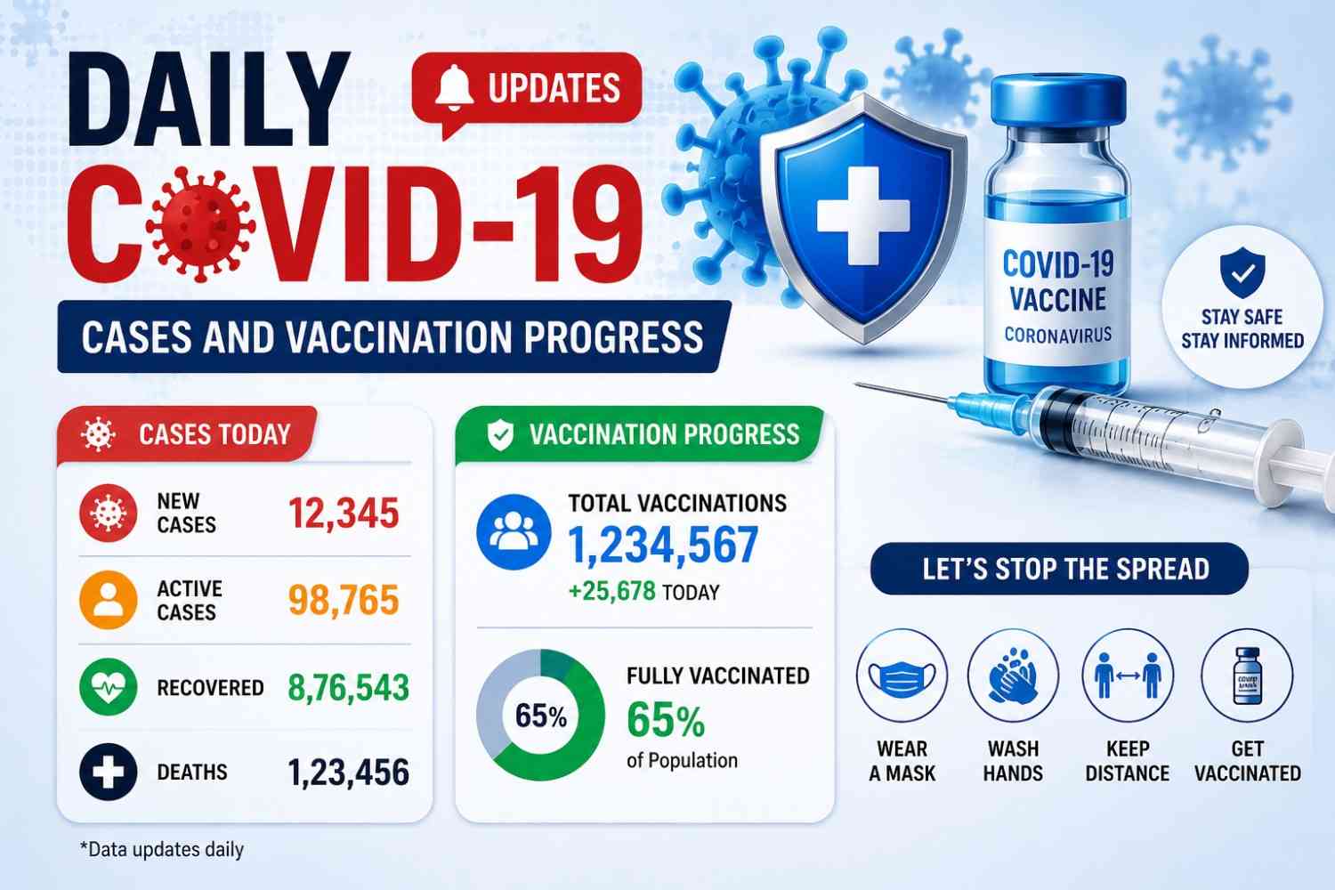

Daily COVID-19 Updates: Cases and Vaccination Progress
Daily COVID-19 Updates: Cases and Vaccination Progress Explained
Daily COVID-19 Updates: Cases and Vaccination Progress remain important for readers, families, workplaces, travelers, healthcare teams, and anyone who wants to understand public health trends without confusion. COVID-19 is no longer reported with the same intensity as it was during the emergency phase of the pandemic, but the virus still circulates, new variants can appear, and vulnerable groups still need accurate information. That makes reliable updates useful, especially when they are explained in simple language.
A strong COVID-19 update should not only mention “cases today” or “new vaccinations.” It should explain what the numbers mean, where the data comes from, how often it is updated, and what limitations readers should keep in mind. In my experience, people often misunderstand COVID data because they look at one number in isolation. A rise in cases may matter more if hospitalizations also rise. A fall in reported cases may be less reassuring if testing has dropped. Vaccination progress also needs context because “one dose,” “primary series,” and “updated vaccine” may mean different things.
This guide explains how to read COVID-19 updates professionally, how to understand vaccination progress, which official sources to trust, and which metrics give the clearest picture of public health risk.
Why COVID-19 Updates Still Matter
COVID-19 updates still matter because public health risk can change even when daily life feels normal. Many people no longer check COVID dashboards every day, but that does not mean the data has lost value. A well-prepared update helps readers understand whether infections are rising, whether severe disease is increasing, and whether vaccination coverage is strong enough to protect high-risk groups. For families, this can guide decisions about visiting elderly relatives, attending crowded events, or taking extra precautions during respiratory virus season. For businesses and schools, it can support planning around sick leave, hygiene practices, and indoor ventilation.
The purpose of Daily COVID-19 Updates: Cases and Vaccination Progress is not to create fear. The goal is to give readers practical, balanced, and source-backed information. COVID-19 data is most useful when it helps people make sensible decisions without overreacting to every small change. For example, a short-term increase in cases may be less concerning if hospitalizations remain low and vaccination coverage is strong among older adults. On the other hand, rising hospital admissions may deserve attention even if case numbers seem incomplete.
Because many countries now report COVID-19 less frequently, professional updates must explain both the data and its limits. Readers need to know what is confirmed, what may be delayed, and what should be checked before drawing conclusions.
| COVID-19 Indicator | What It Measures | How to Interpret It |
|---|---|---|
| Reported Cases | Confirmed SARS-CoV-2 infections | Indicates known transmission but may miss unreported cases. |
| Test Positivity | Percentage of positive COVID-19 tests | Higher percentages may suggest increasing community spread or limited testing. |
| Hospitalizations | COVID-19-related hospital admissions | Reflects the burden on healthcare systems and severe illness trends. |
| ICU Admissions | Patients requiring intensive care | Helps identify increases in severe disease. |
| Deaths | COVID-19-related fatalities | Shows long-term severity trends but usually lags behind case increases. |
| Vaccine Coverage | Percentage of people vaccinated or up to date | Indicates the level of population protection against severe disease. |
| Wastewater Surveillance | SARS-CoV-2 detected in wastewater | Provides an early signal of rising infections even when testing declines. |
Cases Show Transmission, But Not the Full Picture
Reported COVID-19 cases are one of the most familiar numbers in public health updates, but they are also one of the easiest to misunderstand. A case count usually reflects confirmed infections reported through testing systems. It does not capture every real infection in the community, especially when people use home tests, do not test at all, or recover without contacting a healthcare provider. This means reported cases can show a trend, but they rarely show the complete scale of transmission.
When reading COVID cases today, it is important to ask how the data was collected. Was it based on laboratory-confirmed tests, healthcare reports, or a national dashboard? Was it updated daily, weekly, or after a reporting delay? These details matter because a sudden drop in cases may reflect reduced testing rather than reduced spread. Similarly, a spike may come from delayed data being added after a weekend or holiday.
I recommend using reported cases as an early signal, not as the final answer. They become more meaningful when compared with test positivity, hospitalizations, wastewater surveillance, and official local guidance.
Hospitalizations and Deaths Show Severity
Hospitalizations and deaths help readers understand the severity of COVID-19 in a way that case counts alone cannot. While reported cases show known infections, hospitalization data shows how many people are becoming sick enough to need medical care. This is especially important for older adults, people with chronic conditions, pregnant people, and immunocompromised individuals. If hospital admissions begin to rise, public health officials may pay closer attention even when reported cases appear stable.
Deaths are another serious indicator, but they often lag behind infections and hospitalizations. This means death data can confirm the impact of a wave after transmission has already increased. Because of this delay, deaths should not be the only metric used to understand current risk. They should be read alongside hospital pressure, ICU admissions, and trends among vulnerable age groups.
A professional COVID-19 update should explain that severe outcomes are influenced by immunity, vaccination coverage, healthcare access, circulating variants, and population age structure. When hospitalizations and deaths remain low, that may suggest stronger protection against severe disease. When they rise together, the situation may require closer attention.
How to Read Daily COVID-19 Case Updates
Daily COVID-19 case updates are useful only when readers understand how the numbers are reported. During the earlier stages of the pandemic, many countries published daily dashboards with confirmed cases, deaths, testing numbers, and vaccination counts. Today, reporting systems are more varied. Some countries still update regularly, while others publish weekly summaries, monthly reports, or respiratory virus surveillance updates that include COVID-19 alongside influenza and RSV. Because of that, the word “daily” should be used carefully.
A responsible article about Daily COVID-19 Updates: Cases and Vaccination Progress should make the reporting period clear. If a number covers the past seven days, it should not be presented as a one-day total. If a source updates every week, the article should say “latest available update” rather than “today’s exact number.” This protects readers from misunderstanding the data and improves trust in the content.
Case updates should also be read as trends, not isolated events. One day of higher numbers may be caused by delayed reporting. One day of lower numbers may happen after a weekend or holiday. A better method is to review the direction over several reporting periods. If cases, test positivity, and wastewater signals rise together, that is usually more meaningful than one unusual daily figure. Good updates explain these patterns clearly so readers can make informed decisions.
Check the Reporting Period First
The reporting period is one of the most important details in any COVID-19 update. A number may look like a daily count, but it could actually represent several days or a full week of reported data. Some dashboards use “new cases” to mean cases added since the previous update, not necessarily infections that happened in the past 24 hours. This distinction is important because COVID-19 data often includes delays between testing, reporting, verification, and publication.
Before using a case number in an article, social post, or public update, check the source’s update date and reporting notes. Look for phrases such as “last 7 days,” “weekly update,” “latest reporting period,” or “data through.” These phrases explain what the number actually covers. If the dashboard does not clearly define the period, avoid making strong claims.
In professional publishing, I recommend adding a short note beside changing data. For example: “Data reflects the latest reporting period available from the official source.” This small detail improves transparency. It also protects your content from sounding outdated or misleading when dashboards revise their figures later.
Compare Cases With Test Positivity
Test positivity is a helpful metric because it shows the percentage of reported tests that come back positive. When test positivity rises along with reported cases, it may suggest that transmission is increasing. When cases fall but test positivity rises, the situation may be more complicated. It could mean fewer people are testing, while a higher share of those tested are infected. This is why test positivity gives context that case counts alone cannot provide.
However, test positivity also has limits. It depends on who is being tested and why. If testing is mostly done in hospitals or among people with symptoms, positivity may look higher than it would in broad community testing. If testing access changes, the trend may shift even if real infections do not change at the same speed.
For readers, the simple takeaway is this: do not rely on case numbers without checking testing trends. A balanced COVID-19 update should mention whether testing levels are stable, rising, or falling when that information is available. This gives readers a clearer sense of how reliable the case trend may be.
Understanding Vaccination Progress
Vaccination progress is one of the most important parts of COVID-19 reporting because it shows how well a population is protected against severe disease. However, vaccine data can be confusing if readers do not understand the terms used in dashboards. Some sources report total doses administered. Others report the percentage of people with at least one dose, a completed primary series, a booster dose, or an updated seasonal vaccine. These categories are not the same, and they should not be mixed together without explanation.
A clear article should explain vaccination progress in practical terms. For example, total doses can show the scale of a vaccination campaign, but vaccine coverage tells readers how many people in a population have actually received protection. Coverage by age group is often more useful than a national average because older adults and medically vulnerable people face higher risk of severe illness. If vaccine uptake is low in high-risk groups, public health concern may remain even if total doses look large.
Daily COVID-19 Updates: Cases and Vaccination Progress should also explain that vaccine recommendations can change. Updated vaccines may be recommended for specific seasons, age groups, or risk categories depending on local health authority guidance. Because of this, the safest approach is to use official sources for medical recommendations and avoid presenting general statements as personal medical advice. The article can educate readers while still encouraging them to follow local professional guidance.
Vaccine Coverage Is Not Just Total Doses
Vaccine coverage means the share of a population that has received a certain level of vaccination. This is more useful than simply counting total doses because one person may receive multiple doses over time. A country may report millions of doses administered, but that number does not automatically show how many people are currently protected or up to date with recommended vaccination. This is why coverage percentages are essential for understanding vaccination progress.
Coverage can be reported in different ways. It may show people with at least one dose, people who completed an initial vaccine series, people who received a booster, or people who received the latest recommended vaccine. Each category answers a different question. “At least one dose” tells us about early access. “Primary series completed” shows initial vaccination progress. “Updated dose” may better reflect current protection according to recent guidance.
When writing for general readers, explain the category being used before presenting the number. For example, say “percentage of adults who received the latest recommended dose” instead of simply saying “vaccinated.” This improves accuracy and avoids confusion. It also helps readers understand why different dashboards may show different figures for the same country.
Booster and Updated Vaccine Data Matter
Booster and updated vaccine data matter because immune protection can change over time. Protection against infection may decrease, while protection against severe disease is influenced by vaccination history, previous infection, age, health status, and the circulating variant. Updated vaccines are often designed to improve protection against currently circulating strains or to strengthen immunity during periods of higher respiratory virus activity. This makes updated dose uptake an important part of vaccination progress.
For high-risk groups, updated vaccine coverage may be more important than national averages. Older adults, people with weakened immune systems, and people with certain medical conditions may benefit most from staying current with recommendations. If coverage in these groups is low, public health officials may encourage targeted outreach even if overall vaccine uptake appears acceptable.
A professional article should avoid giving personal medical instructions. Instead, it should guide readers to official health authorities and healthcare professionals. A helpful sentence might be: “Check your national health authority or healthcare provider to confirm which COVID-19 vaccine schedule applies to your age and risk group.” This keeps the content useful, accurate, and responsible.
Useful COVID-19 Data Points to Track
A complete COVID-19 update should bring together several data points because no single number can explain the full situation. Cases show reported infections, but they can be affected by testing behavior. Hospitalizations show healthcare burden, but they usually rise after infections have already increased. Deaths show the most serious outcomes, but they are delayed and may be influenced by reporting definitions. Vaccination progress shows population protection, but it depends on age group, timing, and dose type.
This is why professional updates should combine multiple indicators into a simple explanation. Readers do not need overly technical language, but they do need context. For example, if reported cases increase while hospitalizations stay low, the update should explain that severe disease has not increased at the same pace. If wastewater surveillance rises before reported cases, the article can explain that community transmission may be increasing even if testing data is incomplete. If vaccination progress is slow among older adults, readers should understand why high-risk group coverage matters.
Daily COVID-19 Updates: Cases and Vaccination Progress should also help readers identify which numbers deserve the most attention. For a quick public health snapshot, I usually suggest checking hospitalizations, deaths, test positivity, wastewater trends, and updated vaccine coverage. These metrics work best when read together. The table below gives a simple, beginner-friendly explanation of each data point and why it matters.
Key COVID-19 Metrics Table
| Metric | What It Means | Why It Matters |
|---|---|---|
| Reported cases | Confirmed COVID-19 infections reported to official systems | Shows known transmission, but may miss unreported infections |
| Test positivity | Share of reported tests that are positive | Helps judge whether case data reflects wider spread |
| Hospitalizations | People admitted to hospital with COVID-19 | Shows healthcare burden and severity |
| ICU admissions | Severe cases requiring intensive care | Indicates pressure on advanced medical services |
| Deaths | Reported COVID-related deaths | Shows severe outcomes, usually with a reporting delay |
| Vaccine coverage | Share of people vaccinated or up to date | Shows population-level protection |
| Wastewater surveillance | SARS-CoV-2 levels detected in sewage samples | Helps identify trends when testing is limited |
| Variant surveillance | Monitoring of circulating SARS-CoV-2 variants | Helps track changes in virus behavior |
This table is useful because it turns complex surveillance data into a practical reading checklist. Instead of asking only, “How many COVID cases are there today?” readers can ask a better question: “What do cases, severity indicators, and vaccination progress show together?” That shift creates a more accurate interpretation.
For example, rising wastewater signals may suggest increasing community spread before clinical testing fully reflects the change. Rising hospitalizations may indicate that infections are affecting vulnerable people or placing pressure on healthcare services. Stable deaths may suggest that severe outcomes remain controlled, but this should still be checked over time because death reporting often lags behind case trends.
A good COVID dashboard may not include every metric, but it should clearly define the ones it does show. If an article includes this table, it can help readers understand official dashboards more confidently and reduce confusion caused by changing reporting practices.
Which Metric Should Readers Trust Most?
There is no single COVID-19 metric that readers should trust in every situation. The best metric depends on the question being asked. If someone wants to understand transmission, reported cases, test positivity, and wastewater surveillance are useful. If someone wants to understand healthcare impact, hospitalizations and ICU admissions matter more. If someone wants to understand protection, vaccine coverage and updated dose uptake are more relevant.
For a general public update, hospitalizations are often one of the strongest indicators because they show whether infections are leading to serious illness and healthcare pressure. However, hospital data can lag behind infection trends, so it should not be used alone. Wastewater data may provide earlier signs of changing transmission, but it may not be available in every region. Test positivity can support interpretation, but it depends on who is being tested.
I recommend using a layered approach. Start with severity indicators such as hospitalizations and deaths, then review transmission indicators such as cases, test positivity, and wastewater data. Finally, compare these with vaccination progress, especially among high-risk groups. This method gives a balanced view without exaggerating or ignoring risk.
Best Official Sources for COVID-19 Updates
Choosing the right source is essential when writing or reading COVID-19 updates. Health information spreads quickly online, but not every chart, screenshot, or social media post is accurate. Some posts use old figures, some remove important context, and some compare countries using different definitions. For a professional website, the safest approach is to rely on official public health agencies and reputable data organizations that clearly explain their sources.
The best source often depends on the reader’s location. For global data, the World Health Organization provides international dashboards and official public health information. Our World in Data is useful for global comparisons because it organizes data in accessible charts and explains methodology. For the United States, CDC resources provide surveillance, vaccination, and respiratory virus data. For Europe, ECDC provides regional respiratory virus surveillance and public health updates. For country-level decisions, national health ministry websites should usually be checked first.
A high-quality article about Daily COVID-19 Updates: Cases and Vaccination Progress should name the source behind any changing data. It should also tell readers when the source was last checked or last updated. This matters because COVID-19 reporting can change over time. A dashboard that was updated daily in one year may later shift to weekly reporting. By explaining the source and update frequency, the article becomes more trustworthy and easier to maintain.
| Official Source | Primary Focus | Best Used For |
|---|---|---|
| World Health Organization (WHO) | Global COVID-19 surveillance | Worldwide case trends, vaccination updates, and public health guidance. |
| National Health Ministries | Country-specific reporting | Local case counts, vaccination progress, testing, and health advisories. |
| CDC (United States) | U.S. public health surveillance | Hospitalizations, vaccination coverage, respiratory virus monitoring, and guidance. |
| CDC COVIDVaxView | U.S. immunization data | Monitoring vaccine uptake across different age groups and populations. |
| Our World in Data | Global comparative datasets | Comparing COVID-19 trends and vaccination progress between countries. |
| European Centre for Disease Prevention and Control (ECDC) | European surveillance | Respiratory virus activity, COVID-19 trends, and regional public health data. |
Global and Regional Sources
Global and regional sources help readers compare COVID-19 trends across countries, but they must be interpreted carefully. The World Health Organization collects and presents international COVID-19 data, but countries may report at different intervals and with different definitions. This means global dashboards are useful for broad trends, but they may not always match a local dashboard exactly. That difference does not automatically mean the data is wrong; it often reflects reporting methods.
Our World in Data is another useful source for global COVID-19 and vaccination data because it presents charts, country comparisons, and downloadable datasets. It is especially helpful for understanding long-term vaccination progress, cumulative doses, and population-level trends. However, readers should still check methodology notes because population estimates and data availability can affect comparisons.
For Europe, ECDC respiratory surveillance updates can help readers understand COVID-19 alongside other respiratory illnesses such as influenza and RSV. This approach reflects how many public health systems now monitor COVID-19 as part of broader respiratory virus surveillance. For the most local guidance, readers should always check their own national or regional health authority because rules, recommendations, and reporting schedules vary.
How to Verify a COVID Dashboard
Verifying a COVID dashboard is not difficult, but it requires a careful reading habit. The first thing to check is the source. Official government health agencies, public health institutions, and recognized data organizations are more reliable than reposted graphics or unsourced images. Next, check the update date. A dashboard may look current, but if it has not been updated recently, it may not reflect the latest situation.
The second step is to read the definitions. Look for what the dashboard means by “case,” “death,” “hospitalization,” “vaccinated,” or “up to date.” These terms may differ between sources. For example, one dashboard may count only laboratory-confirmed cases, while another may include clinically diagnosed cases. One source may report deaths by date of report, while another reports by date of occurrence.
The third step is to check whether the dashboard explains reporting limitations. Good sources often mention delays, incomplete data, or changes in reporting policy. When those notes are available, include them in your article. A transparent update is more valuable than a dramatic headline because readers can understand the data with the right context.
Step-by-Step Guide to Checking Today’s COVID-19 Data
Readers often search for COVID cases today because they want a fast answer. However, the fastest answer is not always the most accurate one. A better approach is to follow a simple process that checks the source, the reporting period, the main indicators, and the practical meaning of the numbers. This step-by-step method works for general readers, website publishers, content writers, and anyone preparing a public health update.
The first step is to start with an official source. If you need local information, use your national or regional health ministry. If you need global comparison, use WHO or Our World in Data. If you need U.S. data, use CDC resources. If you need European regional surveillance, use ECDC. After that, check the latest update date and reporting period. Do not assume that a dashboard is updated every day unless the source clearly says so.
Next, compare several indicators. Cases alone may not be enough. Look at hospitalizations, deaths, test positivity, wastewater data, and vaccination progress where available. Then add context before sharing the information. A responsible update should say where the data came from, what time period it covers, and what limitations may apply. This process makes your COVID-19 content more accurate, helpful, and search-friendly.
Step 1: Start With an Official Source
The first step in checking COVID-19 data is to choose a reliable source. Official sources reduce the risk of outdated, incomplete, or misleading information. For local case numbers and vaccination progress, national health ministry websites are often the best starting point. These sources usually reflect the reporting rules, testing systems, and vaccination recommendations of that specific country. For international context, WHO and Our World in Data can help compare broader trends.
When using an official source, do not stop at the headline number. Open the dashboard or report and review the notes. Check whether the source explains how cases are counted, how often the data is updated, and whether recent figures are preliminary. These details help you avoid common mistakes, such as treating a weekly total as a daily total.
If you are writing for a website, include the source name near any important data point. For example, “According to the latest update from the national health authority…” is clearer than saying “new data shows.” Source transparency builds trust and supports better SEO quality.
Step 2: Review Cases, Severity, and Vaccines Together
After choosing a reliable source, review cases, severity indicators, and vaccination progress together. This creates a fuller picture than any single metric can provide. Reported cases may show known infections, but hospitalizations show whether people are becoming seriously ill. Deaths show severe outcomes, but they usually lag behind earlier infection trends. Vaccination progress shows how much population protection exists, especially among groups at higher risk.
A practical method is to ask three questions. First, are reported infections increasing, decreasing, or stable? Second, are hospitalizations or deaths changing in the same direction? Third, is vaccine coverage strong among high-risk groups? These questions help readers understand whether the situation is mild, uncertain, or concerning.
For example, if cases rise but hospital admissions remain stable, the update should avoid alarmist language. If cases, test positivity, and hospitalizations rise together, the tone should be more cautious. If vaccine coverage is low among older adults, the article should encourage readers to check official vaccination recommendations. Balanced interpretation is what makes the update useful.
Step 3: Add Context Before Sharing
Before sharing COVID-19 data, add the context that readers need to understand it correctly. This includes the location, source, update date, reporting period, and metric definition. Without these details, even accurate numbers can become misleading. A figure such as “5,000 new cases” means very little unless readers know where it happened, when it was reported, and whether it covers one day or one week.
A strong sentence might say: “The latest official update shows an increase in reported cases during the most recent reporting period, while hospitalization trends should be checked to understand severity.” This is more responsible than saying, “COVID is surging,” without supporting context. It tells readers what is known and what should be reviewed next.
For publishers, context also improves content quality. Search engines and answer engines favor helpful, well-structured content that explains meaning, not just keywords. Adding context makes the article more reliable for readers and more suitable for long-term publication. It also reduces the risk of spreading outdated or exaggerated health information.
Common Problems With COVID-19 Data
COVID-19 data is valuable, but it is not perfect. Every public health dataset has limitations, and those limitations became more visible as testing and reporting systems changed over time. In many places, fewer people test through official channels, and many home test results are never reported. Some countries report less frequently than before. Others combine COVID-19 with broader respiratory virus surveillance. These changes do not make the data useless, but they do mean readers need careful explanations.
One common problem is reporting delay. Cases, hospitalizations, and deaths may be added days or weeks after they happen. Another issue is definition differences. A COVID-related hospitalization may be defined differently across regions. Death reporting may depend on whether COVID-19 was the main cause, a contributing factor, or simply present at the time of death. Vaccination data can also vary depending on whether the dashboard counts total doses, completed series, booster doses, or updated vaccine uptake.
A professional article should not hide these issues. Instead, it should explain them in plain language. This helps readers trust the content because it shows honesty and expertise. Daily COVID-19 Updates: Cases and Vaccination Progress are most useful when they acknowledge uncertainty while still giving practical guidance. Clear data literacy is better than false precision.
Reporting Delays Can Change the Numbers
Reporting delays are normal in public health data. A person may test positive today, but the result may not appear in an official dashboard immediately. Hospitals may update admission records after internal review. Death certificates and cause-of-death classifications may take even longer. Because of these delays, COVID-19 numbers can change after they are first published. This is one reason dashboards sometimes revise older totals.
Readers may find this confusing, especially when yesterday’s number looks different today. However, revisions do not necessarily mean the source is unreliable. In many cases, revisions show that the agency is cleaning, correcting, or completing the dataset. The important point is to avoid treating early figures as final. Recent data may be preliminary, while older data may be more complete.
For article writing, use careful wording. Instead of saying “the final number is,” say “the latest reported number is” or “the latest available data shows.” This style is more accurate and professional. It also protects your content from becoming outdated when official sources revise figures later.
Different Sources May Show Different Totals
Different COVID-19 sources may show different totals because they use different methods, cut-off times, population estimates, or reporting definitions. For example, a national health ministry may update data before an international dashboard receives it. A global dataset may standardize figures for comparison, while a local source may present more detailed regional data. These differences can create small or sometimes noticeable gaps between sources.
This does not always mean one source is wrong. It often means the sources are answering slightly different questions. One may focus on confirmed laboratory reports. Another may focus on weekly surveillance. Another may present cumulative vaccination doses using a standard global population estimate. When readers do not understand this, they may assume the data is contradictory.
A good article should help readers compare sources intelligently. If exact figures differ, explain that official local sources are usually best for local decisions, while global sources are useful for comparison. Also recommend checking methodology notes before drawing conclusions. This approach keeps the content balanced and avoids unnecessary confusion.
Quick Answer About Daily COVID-19 Updates: Cases and Vaccination Progress
Daily COVID-19 Updates: Cases and Vaccination Progress help readers understand current coronavirus trends, vaccination coverage, hospital pressure, and public health risk in a clear way. The most reliable updates come from official sources such as the World Health Organization, national health ministries, CDC for U.S. data, ECDC for European surveillance, and Our World in Data for global comparisons. However, case numbers should be interpreted carefully because many countries no longer report COVID-19 data daily. A useful update should compare cases, hospitalizations, deaths, test positivity, wastewater signals, and vaccine coverage rather than relying on a single figure. This gives readers a more accurate picture of real-world risk.
Frequently Asked Questions
Frequently Asked Questions (FAQs) are an important part of any fitness guide because they provide quick, clear answers to the most common doubts people have. Instead of going through long explanations, readers can use FAQs to understand key concepts in a simple and direct way.
In fitness, people often struggle with similar concerns such as workout routines, diet plans, progress timelines, and motivation. FAQs help simplify these topics and make it easier to apply practical steps in real life.
They also serve as a quick summary of the most important points covered in a guide. By reviewing FAQs, readers can reinforce their understanding and make better decisions about their fitness journey.
What is the best source for daily COVID-19 updates?
The best source for daily COVID-19 updates is usually your country’s official health ministry or public health agency because local authorities understand national testing systems, hospital reporting, vaccination programs, and public guidance. For global context, the World Health Organization and Our World in Data are useful because they organize international trends and vaccination information. For the United States, CDC surveillance and COVIDVaxView resources are appropriate. For Europe, ECDC respiratory surveillance updates are helpful. Always check the update date, reporting period, and metric definitions before using a number. If a dashboard no longer updates daily, describe it as the latest available update rather than a true daily figure.
Are COVID-19 cases still updated daily?
COVID-19 cases are not updated daily in every country anymore. Many public health systems changed their reporting schedules after the emergency phase of the pandemic. Some countries still provide frequent updates, while others publish weekly, monthly, or respiratory virus surveillance reports that include COVID-19 alongside influenza and RSV. This is why articles about Daily COVID-19 Updates: Cases and Vaccination Progress should be careful with wording. Instead of assuming that every number reflects the past 24 hours, check the reporting notes on the official dashboard. If the data covers a week, say so clearly. This helps readers avoid misunderstanding the size or timing of changes.
How can I check vaccination progress?
You can check vaccination progress through official health authority dashboards, WHO vaccine data, CDC COVIDVaxView for U.S. coverage, and reputable global datasets such as Our World in Data. When reviewing vaccine information, look beyond total doses. Check whether the dashboard reports people with at least one dose, completed primary series, booster doses, or updated vaccine coverage. These categories measure different things. For personal decisions, always follow local medical guidance because vaccine recommendations may depend on age, health condition, pregnancy status, immune status, and seasonal advice. For article writing, define the vaccine category clearly so readers understand what the number actually represents.
Why do COVID-19 numbers change after publication?
COVID-19 numbers can change after publication because public health data is often revised. Late test reports, hospital record updates, duplicate removal, corrected location data, and delayed death registration can all change previously published totals. This is common in health surveillance and does not automatically mean the original source was unreliable. It means the dataset is being updated as more complete information becomes available. For this reason, writers should use phrases such as “latest reported data” or “latest available update” instead of presenting recent numbers as final. Readers should focus on trends over several reporting periods rather than reacting to one revised figure.
Which is more important: cases or hospitalizations?
Cases and hospitalizations both matter, but they answer different questions. Reported cases show known infections, while hospitalizations show how many people are sick enough to need medical care. In periods when testing is limited, hospitalization data may be more useful for understanding severity and healthcare burden. However, hospitalizations can lag behind infections, so case trends, test positivity, and wastewater signals can still provide early warnings. The best approach is to compare several metrics together. If cases rise but hospitalizations remain stable, the situation may be less severe. If both rise together, public health concern may increase.
Should I use COVID-19 data for travel decisions?
COVID-19 data can help with travel decisions, but it should not be the only factor. Before traveling, check official guidance from your destination, airline, local health authority, and national government. Look at recent case trends, hospital pressure, vaccination recommendations, and any entry or testing requirements that may apply. Rules can change, especially during periods of rising respiratory illness. If you are older, immunocompromised, pregnant, or traveling with vulnerable family members, consider checking with a healthcare professional before making plans. For general awareness, Daily COVID-19 Updates: Cases and Vaccination Progress can help you understand whether risk is increasing or stable.
Conclusion
Daily COVID-19 Updates: Cases and Vaccination Progress remain valuable when they are written with accuracy, context, and source transparency. Readers need more than a single case number. They need to understand what the number means, how often it is updated, whether reporting delays may apply, and how it compares with hospitalizations, deaths, test positivity, wastewater surveillance, and vaccination progress. A professional article should make those details easy to understand without creating fear or confusion.
The most reliable updates come from official public health sources, national health ministries, and recognized data organizations. However, even official sources can use different definitions and reporting schedules, so careful interpretation is essential. In my experience, the strongest COVID-19 content explains uncertainty clearly. It does not exaggerate risk, but it also does not ignore real public health signals.
For publishers, this topic works best as a practical, evergreen guide that can be updated with new source links and the latest dashboard information. Add a visible “last updated” note, cite official sources, and keep medical advice aligned with local health authority guidance.